After four decades of change, our logo has evolved once again, blending timeless tradition with a modern perspective.
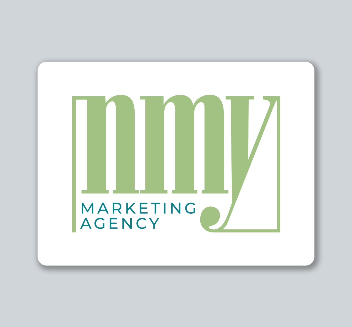
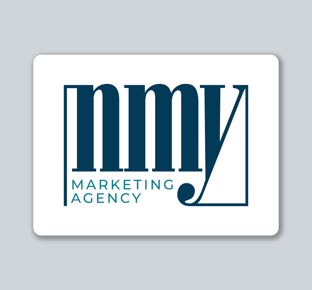
Over the years, our logo has evolved to reflect both cultural shifts and internal growth. Now, after 40 years, we’re proud to introduce our latest evolution. This redesign pays homage to our advertising roots with a bold serif font that evokes the timeless authority of classic newspapers. A clean sans serif counterpart adds a modern edge, while the enclosing box brings balance and cohesion—creating a mark that feels solid, confident, and enduring.
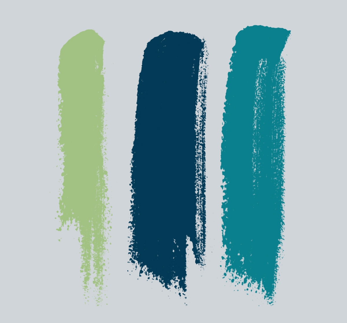
Our color palette blends boldness with stability. Mint green serves as a striking accent, ideal for moments that call for energy or emphasis. Navy blue anchors the palette, providing a strong, versatile foundation that’s highly legible and adaptable across our branding. Teal bridges the two, complementing both mint and navy while offering a flexible accent that ties the palette together seamlessly.
Thanks for coming along with NMY on our journey for these 41 years!